Archive
Interview with cover artist Per Nordin
Per Nordin (Composer, Graphic artist and cover-artist for Transatlantic) interviewed by Ian Oakley.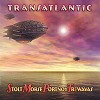 In February 2001, from a poll of 700 entries, Per Nordins cover work for
Transatlantics "SMPT:e" was voted by the readers of
The Dutch Progressive Rock Page
as "Best
Artwork" of 2000. Per is currently designing the artwork for the second (as yet
untitled) Transatlantic album.This is an interview I did with Per originally as part of
the album launch. - Ian February 2001
Ian: Per, as we can see from your site you are a very talented graphic artist is this your main work?
Per:. Thank you for the kind words. I'm always flattered and happy when my work is appreciated. As far as income goes, no, this is not my main work - yet. But as far as life goes the answer is yes - my main work is being a composer and a Photo/pixel artist. That is what I do to live. I do other things from time to time to 'pay' for my living.
Ian: I know that you have a lot of personal involvement with this project. How did this happen?
Per: Well, I've known Roine for a long time. I first met him when he played in Kaipa, even though we never got very close then. Instead, I became good friends with Tomas Eriksson, the bassist of Kaipa. When Tomas left Kaipa, he started a recording studio - Studio 55 - and I was occasionally there, chatting, chilling out or using the studio facilities. When Roine left Kaipa, he also eventually wound up at 55 as a technician / producer, both in-house and with his own various projects. Roine was my sound technician when I staged a whole-night solo-concert in the castle garden here in Uppsala.
Over time, we built up a growing understanding as we where both very much involved in music with similar emotional/spiritual goals. The whole idea behind the Flower King is something I support to 100%. But as both of us where very busy with our own projects we didn't meet very often. However, when my long time friend Hasse Bruniusson (The Flower Kings / Samla Mammas Manna) convinced Roine that The Flower Kings needed a website he asked me to make it.
Since then Roine and I have collaborated often, first as me being his webspinner, then his computer/PhotoShop aid. We have become very good friends (and I am very pleased for that: he enriches my life and inspires me a great deal, both as a human and artist and as a professional). As friends, he has let me be privy to a lot of the going on's with "the group formerly known as SMPTe/ Second Nature, now symbolized by a 'blimpoid'", as I jokingly call them).
Ian: I heard that it was actually you that came up with the name Transatlantic
 Per: Yes. On the phone, speaking about how things where progressing,
Roine mentioned that he didn't like either the project names
"SMPTe" or "Second Nature". I agreed, thinking that
SMPTe was silly, since not many know what SMPTE is (apart from the
not-so-unimportant fact that no SMPTE synch was used for the recordings)
and thought that "Second Nature" would be better as the title
of a follow-up CD, but not as a group name. My feeling was that such a
name more or less degregated their involvement in their "real"
groups, indicating in my mind that "OK, we play in these other
groups, but THIS is the REAL thing, our Second Nature; something
COMPLETELY different." Or else it would mean that you have been at
something for so long that it has become ones second nature. Well, this
music is not completely different from what they do in their respective
groups, nor have they been playing together long enough for it to have
become a second nature to them. You see, I think a group name is
something very commiting and should mirror the intentions, feelings or
some other factual state of the group. "Second Nature" simply
gave the wrong signals to me, and aparently didn't sound good to Roine
either. So I suggested "Transatlantic" as group name, since
these guys live, met and worked " Transatlanticly": two in the
USA and two in Europe. It sort of made more sence in my mind.
Per: Yes. On the phone, speaking about how things where progressing,
Roine mentioned that he didn't like either the project names
"SMPTe" or "Second Nature". I agreed, thinking that
SMPTe was silly, since not many know what SMPTE is (apart from the
not-so-unimportant fact that no SMPTE synch was used for the recordings)
and thought that "Second Nature" would be better as the title
of a follow-up CD, but not as a group name. My feeling was that such a
name more or less degregated their involvement in their "real"
groups, indicating in my mind that "OK, we play in these other
groups, but THIS is the REAL thing, our Second Nature; something
COMPLETELY different." Or else it would mean that you have been at
something for so long that it has become ones second nature. Well, this
music is not completely different from what they do in their respective
groups, nor have they been playing together long enough for it to have
become a second nature to them. You see, I think a group name is
something very commiting and should mirror the intentions, feelings or
some other factual state of the group. "Second Nature" simply
gave the wrong signals to me, and aparently didn't sound good to Roine
either. So I suggested "Transatlantic" as group name, since
these guys live, met and worked " Transatlanticly": two in the
USA and two in Europe. It sort of made more sence in my mind.As an album title my suggestion was "Bridging the boundaries" or something like that, both to allude more to the geographical displacement of the members (and what recording problems that gave) and also that the various groups they originate in are actually rather diverse in musical styles. Roine liked "Transatlantic" and forwarded the suggestion to the others, which they accepted it, but they have had a hard time letting go of the SMPTE habit.
The way it stands now one can read "Transatlantic" as the album name and Stolt-Morse-Portnoy-TrEvawas (SMPTe) as the group, or read 'Transatlantic' as the group name and the SMPTe thing as just who are the members of Transatlantic. This leaves both doors open for future debates.
Also I thought the name Transatlantic would fit the cover picture very well :-)
Ian: What gave you the idea / inspiration for the final album cover?
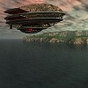
Per: Well, the FINAL album cover is inspired by lots of nagging about people not being happy with the colours, LOL. The original blimpoid-over-water picture I made several years ago, just for fun and to practice at making wings in Bryce. It was never more than an etude. As you see on the various versions it's not really strictly a blimp, but rather a blimpish air vehicle: a blimpoid. Anyhow: as with many of my pictures, Roine had seen it at some occasion and it sort of stuck in his memory.
When the other guys in Transatlantic wanted "Roine's art guy" to make the booklet, they didn't know that Roine's art guy is Roine (for those who don't know: "Hippified Art" is just a cover name for Roine... He thinks his name is visible enough as it is on the The Flower Kings CDs, so instead of saying "layout by Roine" he chose the pseudonym "Hippified Art"). Anyhow, Roine asked me if he could use the blimp for the cover and I was naturally happy. But since the original picture had other dimensions and was really far from perfect, being just a test, I decided to remake it... I started out by changing the pictures dimentions from the original 4x3 aspect to a CD's 1x1. Then I remade the sky and water totally, and changing the materials and colors of the blimpoid, choosing colours I sort-of knew what Roine likes. Also after having listened to an early recording (pre-pre-mix or dubs) I felt that it should have a slight element of power in it, but be predominantly peaceful, happy, soft, since the power in it is a positive power, not destructive force.
 So I made it blue-ish, with a slightly purple sky, the blimp moving
inwards into the picture (toward the viewer's direction) with the rings
purple (now they are red). I also made about a dozen versions, more or
less haphazardly, with more or less wild colours. I then took all these
over to Roine and slide-showed them to him. "Humm... this is nice,
this one too... this has more power, but this is more dreamy... I like
this sky, but I like the water better on this one... this is too cold,
but this one is too warm... quot; he went on as we looked at the
pictures. We eventually narrowed it down to 4 possible pictures and then
asked his wife Lilian to take a look, and just say if any of these
caught her eye more than the others. Yep, and it was decided... she
chose the one that both Roine and I also felt was best as a CD cover.
So I made it blue-ish, with a slightly purple sky, the blimp moving
inwards into the picture (toward the viewer's direction) with the rings
purple (now they are red). I also made about a dozen versions, more or
less haphazardly, with more or less wild colours. I then took all these
over to Roine and slide-showed them to him. "Humm... this is nice,
this one too... this has more power, but this is more dreamy... I like
this sky, but I like the water better on this one... this is too cold,
but this one is too warm... quot; he went on as we looked at the
pictures. We eventually narrowed it down to 4 possible pictures and then
asked his wife Lilian to take a look, and just say if any of these
caught her eye more than the others. Yep, and it was decided... she
chose the one that both Roine and I also felt was best as a CD cover.Then started the next phase: making a good picture perfect... mixing water from a few different renders and skies from another to add more depth, minute elements from one blimp merged into the body of another, etc. The fonts where a great source of debate... Roine and I have at times totally different ideas about fonts, but after a while we came up with a text on the cover we both liked. But the following days Roine (also he being a perfectionist) doodled on and did some more changes until he arrived at a new version. He showed it to me and I took the initials and "wove them into" the names, added bevel and more depth in the colours and we where done!
Ian: Did you have to make a lot of changes to satisfy the band and record companies?
Per:. Both yes and no. Roine was harder pressed with the inside of the booklet than I was with the cover. At first Roine wanted to make the inside of the booklet very strict, but the others wanted it more freak-outed, more 'Hippiefied', so to say, so he needed to remake it several times. Also the song-order was not finalised until at the mastering. He sent out for proof-readings that never where adhered and there where much discussions about the photos, fonts, etc, etc. So his was the greater troubles. But I had my share too. We uploaded all the stuff completed to date: cover, booklet, onto the web (a secret URL under The Flower Kings band Homepage) so the others could see and comment... Only to find out that Neal (Morse - Spock's Beard) preferred another of my blimp pictures, one that I had made as a potential back-cover, not at all suited as a front cover picture IMO, as it was a night picture, the blimp in the distant and very "quiet". It's a cute picture, but not well suited as front for this music. But for a long time Neal came back to this pic and expressed that he prefered it, but would yield if everyone else liked the intended cover.
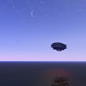


From left to right: 1) The picture that Neal Morse liked, 2) The poster idea that the German company liked, 3) The "original" German cover, made from the above poster idea.
Then the German record company said that they have this thing against purple... also the "inter-woven" initials where judged to be too difficult to read (which I actually afterwards agreed with) So I did a new "semi-inter- woven" version, where the S and T where free and only M and P where partly woven in to the names, making it legible yet still having that extra element of refinement, IMO. For the graphic they pointed to a poster idea I had posted and said they wanted that picture as cover, which is strange, as it in my eyes holds lots of purple.
Then I remade that poster picture to CD format, I at the same time did a few other version, more "powerful" colours and more reddish sky, which now will be the European cover instead of the poster-made-CD picture.
Ian: So, the blimps were your original idea from the start. Were there other previous, rejected ideas?
 Per: Well, strictly it was Roine's idea to use my blimp for the cover
pic. But, yes, there where several rejected ideas / versions. E.g. I
made a few early sketches more or less inspired by "Nursery
Chryme", using a version of the blimp (miss-shaped into a
plane-like thing), all done in haste and not very good ideas at all, I
must admit. LOL. Sometimes I can just go overboard and display an
endless amount of poor taste and judgment, when under stress! Also I
made a version slightly inspired by David Palermo, who Roine likes and
various variations of blimps in various colors. Along the road I also
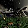
made many therapeutic version for my own sanity: rusty, forlorn,
happless blimps struggeling over vairous desecrated landscapes... you
understand sitting day after day rendering and polishing the cover pic
made me want to puke over it, my eyes lost all critical (or sometimes
non-critical) relationship to the pic, so I needed to cleans my eyes and
mind by making these other more morose versions, like the one on the top
of this page.
Per: Well, strictly it was Roine's idea to use my blimp for the cover
pic. But, yes, there where several rejected ideas / versions. E.g. I
made a few early sketches more or less inspired by "Nursery
Chryme", using a version of the blimp (miss-shaped into a
plane-like thing), all done in haste and not very good ideas at all, I
must admit. LOL. Sometimes I can just go overboard and display an
endless amount of poor taste and judgment, when under stress! Also I
made a version slightly inspired by David Palermo, who Roine likes and
various variations of blimps in various colors. Along the road I also
made many therapeutic version for my own sanity: rusty, forlorn,
happless blimps struggeling over vairous desecrated landscapes... you
understand sitting day after day rendering and polishing the cover pic
made me want to puke over it, my eyes lost all critical (or sometimes
non-critical) relationship to the pic, so I needed to cleans my eyes and
mind by making these other more morose versions, like the one on the top
of this page.Ian: How long did it take to design the cover to everyone's satisfaction?
Per: You really don't want to know... it took LOOOONG time before everyone was fully happy, or as happy as they would get... In a desperate attempt to satisfy various opinions of blue vs purple, Roine pulled my pic through vairous PhotoShop filters leaving the whole pic a pale lifeless cyan... and as if that wasnt enough, he put in another blimp, sailing upp in the corner, nose uppward and resized and cut out so sadly sloppily I felt like crying. I told him that if he wished he could use the pic, but I dont want my name on it: I didnt want to be assosiated with such blatent lack of craftsmanship. So instead he said that if I wanted to, I could re-render a new one to get it the way I could live with it, yet still loose all purple. So I did... it didn't just take one new render. Instead I rendered several new versions using different lens-angles and sky/waters and mixed them together to get a pic that was more homogenous in color, yet had the color depth that I wanted. To be sure not to go through the whole process again, I did the final assembling in PhotoShop on Roine's computer, so he could OK it on the spot. I think that whole insident was just a result of Roine beeing under great ammount of stress around this project. Anyhow, it all ended happily, and actually became a much better pic than the previous cover version. I don't know how many can see the difference, but in my eyes the difference is great. This final version has much more subtleties happening in the water and sky making it strikingly better. Then there is the poster idea the German company pointed to. It was not in the CD 1x1 proportions but they still wanted that picture on their release... so I had to remake that picture, converting it from some absurd poster dimensions (4 x 7 or something like that) to CD dimensions (1x1). At the same time re-rendering it to further improve the sky. All in all I think I did some 60+ full renders in Bryce (not to mention all the endless numbers of minor renders that I aborted to make alterations) to end up with those 2 covers. Some of the more obscure variations I made took some 12 hours to render a single picture... too many things happening in the sky and water.
Ian: What process did you use? Was it all computer designed or first actually drawn and painted?
Per: I'm not good at drawing, except maybe nature abstracts, and I haven't done any painting for many many years, and when I did paint, I
 only did so for recreation, never as an art. The basic pictures are all
made in the 3d program Bryce 2. I rendered several versions with minor
adjustments and then lifted the whole shebang into PhotoShop to put on
filters (softer glitter in the water, softer sky, slightly more depth in
the blimp by adding elements from 4 blimp renders, the blimp emerging
from the mists) as well as the text. On my text version, the title-text
"Transatlantic" alone consists of 4 or 5 layers blended
together, and the Stolt-Morse-Portnoy-Trevawas is made up of some 6
layers and masks. The sky of the European version is a merge of some 5-7
different layers, if I remember correctly and the water of yet another
half-dozen or so.
only did so for recreation, never as an art. The basic pictures are all
made in the 3d program Bryce 2. I rendered several versions with minor
adjustments and then lifted the whole shebang into PhotoShop to put on
filters (softer glitter in the water, softer sky, slightly more depth in
the blimp by adding elements from 4 blimp renders, the blimp emerging
from the mists) as well as the text. On my text version, the title-text
"Transatlantic" alone consists of 4 or 5 layers blended
together, and the Stolt-Morse-Portnoy-Trevawas is made up of some 6
layers and masks. The sky of the European version is a merge of some 5-7
different layers, if I remember correctly and the water of yet another
half-dozen or so.Ian: Are the final designs your own personal choice?
Per: I like the "original" German version, with 3 blimps in a row, flying in formation... the one based on the "poster" idea. It is softer than the final German version, which is more "industrial" in my eyes, more "fire" and "war". Yet I feel that the final German version is more eye-catching, and therefore better for its purpose (also, it too has more depth and detail than the "original" German version). I know Roine is most partial to the US cover. But I like all versions for various reasons. But I might say that my favorite version is still not made, but deadlines and other's opinions rule reality.
You see, I have a hard time letting go of a picture and saying "this is it, this is the ultimate version". I tend to work on a pic for years, coming back to it with more knowledge and better program uppdates. Some of my first Bryce pics, made in Bryce 1 many years ago, have migrated through the years to better program versions with better render or better material (and me having a faster computer to process more complex materials) and are still being polished on now in Bryce 4.
Having said all this, I must conclude with that I am very happy with the pictures as they will appear on the covers, have no doubt of that. If not, I would not let them be used. But following my habbit of not leting go of
 a pic for good, I've incorporated the blimpish thing into a few new pics.
You can see one example here.
But as a detail I must mention that I dont like the final text on the bottom
of covers. Following common request, Roine remade the fonts a last time, both
switching colors and most importantly changing the style of the names at the
bottom. I personally thing this final text looks bland and lacks the depth
or the air of quality and refinement that the other "semi-interwoven"
text has. But I belive I am alone with that opinion. Everyone els in the
project seems to prefere the text as it will appeare now on the print.
So I'd say my favorite version isn't in this case a different pic, but a
different font, but that is outside my domain.
a pic for good, I've incorporated the blimpish thing into a few new pics.
You can see one example here.
But as a detail I must mention that I dont like the final text on the bottom
of covers. Following common request, Roine remade the fonts a last time, both
switching colors and most importantly changing the style of the names at the
bottom. I personally thing this final text looks bland and lacks the depth
or the air of quality and refinement that the other "semi-interwoven"
text has. But I belive I am alone with that opinion. Everyone els in the
project seems to prefere the text as it will appeare now on the print.
So I'd say my favorite version isn't in this case a different pic, but a
different font, but that is outside my domain.Ian: Have you designed any other album/ CD covers?
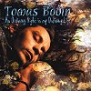 Per: Not many, but yes, a few. E.g. I did the front picture of Tomas
Bodin's (The Flower
Kings) solo release "An Ordinary night..." I've also done a
few "local" jobs here in Uppsala. I've been "behind the
scenes" a bit with Roine's covers. Several of the photos used on FK's
CDs are mine, but honestly... Roine has 'Hippified' them to the extent that
none can say which are mine, which are his wife Lilian's or which are just
optic illusions, LOL :-)
 I've come with several cover ideas for Flower
Kings CD's but have had them rejected. Roine likes to do it all, even though I've
from time to time helped him with tecnical sollusions. In a planned update to
my homepage, Im thinking to post several "alternative" versions
of the 'Transatlantic' covers, as well as the rejected versions of
Flower Power and other accepted or rejected commissions, like this one
below... its my variation of Roine's idea for the Flower Power cover.
I've come with several cover ideas for Flower
Kings CD's but have had them rejected. Roine likes to do it all, even though I've
from time to time helped him with tecnical sollusions. In a planned update to
my homepage, Im thinking to post several "alternative" versions
of the 'Transatlantic' covers, as well as the rejected versions of
Flower Power and other accepted or rejected commissions, like this one
below... its my variation of Roine's idea for the Flower Power cover.Transatlantic is by far the "biggest" job I've done as to date. I am very pleased and honored to have my art on this release, both because I like and respect the music and also for the undeniable fact that it will give me more PR than any other publication I've been on/in yet. And, of course I hope it opens doors for more such work.
Ian: Are there any particular artists that you feel you are influenced by?
Per: Life. Emotions. Nature. God.
There are many artists I love, but I am not inspired by anyone as far as the picture content or style... for that I get my inspiration from the above mentioned. But others can inspire me to go on with art (and music), or inspire me in such a way that I love looking at them (Jock Sturges, Renoir, Dali in the 50:s, many traditional Chinese landscape paintings, Jan Ternald, Katarina Grette, Lise LeBel to mention a very few). But my greatest source of visual joy is from nature and the beauty of the naked female body.
Ian: Have you listened to the album and do you like it?
Per: I must point out that Transatlantic's music is of a kind I rarely listen to, and I must admit that - save a few tracks Roine played for me - I've not heard Spock's Beard, nor Dream Theater, and as for Marillion I haven't heard them since, well, since they where new. But I found the Transatlantic music very well composed, nicely performed and in all ways well done... I like parts of it very much, and can enjoy much of the fineries in it, but its honestly not my normal kind of music, so my opinion is subject to personal disinterest in rock and should not be taken very seriously. But for being rock, this is a great CD!
 I heard a very early version of Morse's "Let there be Light"
but with Roine singing.(Later used on the bonus CD) When Roine played it
to me, I thought it was he who had composed it... his voice was really
in the lyrics and he sounded totally convincing. In the final version
Neal is singing. But, in my own personal opinion, he does not sound as
convincing in that song as Roine did, even though Neal undoubtedly does
a very good job at singing his own song... But the way my heart hears
it; Neal SINGS the lyrics... Roine LIVED or even WAS the lyrics. But
again, that is just my opinion. Actually, if I recall correctly, Neal
was hesitant to include that song, but it was Roine that more or less
insisted that it be on the CD. That shows how close it was to Roine's
heart, albeit it was Neal that composed it.
I heard a very early version of Morse's "Let there be Light"
but with Roine singing.(Later used on the bonus CD) When Roine played it
to me, I thought it was he who had composed it... his voice was really
in the lyrics and he sounded totally convincing. In the final version
Neal is singing. But, in my own personal opinion, he does not sound as
convincing in that song as Roine did, even though Neal undoubtedly does
a very good job at singing his own song... But the way my heart hears
it; Neal SINGS the lyrics... Roine LIVED or even WAS the lyrics. But
again, that is just my opinion. Actually, if I recall correctly, Neal
was hesitant to include that song, but it was Roine that more or less
insisted that it be on the CD. That shows how close it was to Roine's
heart, albeit it was Neal that composed it.There is much power in this CD. I think it is a very good mixture of the people involved. They compliment each other in a good way, opening the music to many different listeners. Id say that it matters not if you are a Dream Theater fan, Spock's Beard, Marillion or Flower Kings fan: you will love this music, and both find much from your favorite band, but also much that will open your ears to other areas of Rock. I believe this CD will not only be limited to the respective fan-groups but will reach a much wider audiences with appreciation, than the various groups alone do. The power of synergy!
Ian: You are also a composer. How would you describe your own music?
Per: Well... Id guess the easiest way is saying, "not-mainstream". It is more easy to say what I don't compose: I don't compose anything you would normally hear on the radio... no rock, no pop, no disco, no hiphop, no jazz, no country, no dance, nothing ever airable on MTV or playable on The David Letterman Show. What's left, you may ask? Way over 90% of what is aired on TV/Radio is about 0.2% of music styles available or possible.
In whatever style I use, my main aim is to confer emotions, to inspire and uplift. The emotion of my music is often a sweet, sad longing. Sometimes my music is extremely happy, sometimes bordering to the morbidly morose, often very restful but most predominantly is the sweet longing, what in Swedish is called "vemod"... there is no equivalent in the English language. As for styles, I can mention minimalistic, neo-impressionistic, expresionistic, free-poly- and atonal, and last but not least various styles of EAM (electronic music), with inspiration from e.g. Steve Reich, Javenese Gamelan, Toru Takemitsu, Ĺke Parmerud, et sim.
Ian: Can anybody hear / download examples from the net?
Per: I used to have some MP3 snippets from my (long time) coming electronic music CD "Alternate Realities" but after a server crash I haven't taken the time to upload them yet again. But since I hope I'll be having many more visitors after Transatlantic hits the shelves, I have planned to finally do the update I've planned so far, including MP3's of several of my music styles: instrumental childrens music, orchestral music, etc. So go check: by the time you read this there may be at my web "the Lonely Arts Club".
Ian: Is there anything available commercially?
Per: You can hear 2 (3) of my pieces on the FK fan CD, one for tuned-toms and timpani (Dance of Life), the same re-voiced for gamelan (Dance of Joy) and a piece for four woodwinds (But My Longing Was So Strong).
Also, a MC release was issued several years ago containing some free form improvisations with me, Hasse Bruniusson and Eino Haapala (Zamla) on a small Swedish label named Slask Records, but I have no idea what has happened with that release. Hasse has said that he wishes to use parts of it on some upcoming CD, but at the moment I think that release is gathering dust at Slask Records basement.
Apart from that, the answer is no not yet but my long planed electronic music CD "Alternate Realities" will be released during this year and available via the Electronic Music Foundation. After that, my plan is to release some of my orchestral music, a suite of instrumental children's music I've planned and worked on for a long time, more of my electronic music and finally some of my more quot;normal" music.
It is all a matter of time/costs, since Ill be doing and paying everything myself: composing, recording, mixing, mastering, cover art, layout, and not to mention financing. If anyone wants to contribute financially for the betterment of culture, I'm not too proud to accept donations :-)
Ian: Per, thanks very much for finding the time to talk to us.
All artwork on this page is owned and designed by Per Nordin and may not be copied or reproduced without his express written permission. Feel free to visit his website, the Lonely Arts Club.
nealmorseband.com | roinestolt.com | mikeportnoy.com | marillion.com | Webmaster: Mark Bredius 2000-2025
